 Things sure get busy this time of year! Now that my three new Montlake books have been launched, I've been catching up with other projects. And night I finally finished and posted one of my most ambitious projects, THE MUDLARK, ILLUSTRATED. It went live on Kindle this morning and is available on the Kindle Prime Lending Library.
I lost track of exactly how many illustrations I have in the final version-somewhere around 35, and I was sad that I couldn't keep all of the ones I had designed. But I think I'll put up a page on my web-blog for all of them. I had about 70 total. Or maybe I'll find more uses for them in other books. I originally put up many of the illustrations in a running blog about 2 years ago, published at one chapter a day. It was fun, but I took it down because I needed to do a more professional job. Not all of those illustrations could be used, and I had some new ones I wanted to add.
.jpg)
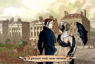
I didn't make any strong attempt to stick to one style of illustrating because I was having a grand time finding old engravings and paintings and re-imagining them with modern photography and my own art to illustrate this particular story. I used the couple you see on the cover (Yuri Arcurs, photographer) in several illustrations partly because there are so many photos available and usually with their wonderfully brilliant smiles, but even more because they look to me just like I think Izzy and Tristan would look. But to place a modern photo against a 19th century engraving or watercolor means both images have to be stylistically manipulated to make them seem to fit together. This cover design, for instance. has the couple rendered int a sketch-like look, using the original photo to color it. But Izzy also is wearing a dress and shawl taken from a fashion plate in 1812 (and altered to fit). In the background, you see a re-rendering of a watercolor, Cascade at Rydal Water, by one of my favorite 19th century artists, Francis Nicholson.
 |
| Cartoon Tristan and Izzy against Berkeley Square engraving |
On the other hand, I didn't mind at all using other photographic images to portray my characters, or to use engravings or paintings from different eras it they portrayed the story. Since there are sort of allegorical allusions to knights in shining armor and Shakespeare's Romeo and Juliet, it was fun to use those pictorially too. For this story, a bad joke is every bit as useful as a good one.
So far, the main thing I can say is that I LEARNED A LOT. I didn't really have anyone who could tell me important things like how big illustrations could be, or what the resolution size should be. I'd seen a few books with a few photos in them, but nothing like what I wanted to do. I wanted the illustrations to be major contributors to the book's humor. This is not something I intend to do for every book I put out, and I'm sure not very many authors would want to try such a project. But many might want to add at least a few illustrations.
I'd gotten some guesses on maximum size for an ebook at "maybe 5 megabytes", but the reality is, nobody seems to know, and it probably has changed a lot. Since images take up so much more "room" in a file than text does, I thought the images would have to be very small, or low resolution, or if a decent size, limited in number. So my first mistake was starting off too small. The images had no real impact. And the little text banners I'd put on each one were so small, they couldn't be read. That defeated the whole purpose. So I "un-published" and went back to the original images which were much larger, and reduced to a "medium" size. They still weren't big enough. I had to publish and re-publish three times so far before I got it right, each time re-building the size I wanted from the original images. In some cases I was stuck with just enlarging an image that was pretty small in the first place, and those are just a bit fuzzy. But it can't be helped.
 |
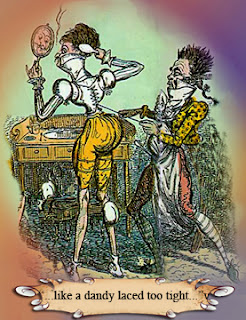
| Cruikshank's Dandies Dressing |
Another thing I learned in the second round of publishing was that the images didn't enlarge on the Kindle when I enlarged the text. They stay exactly the same. Darn. And they wouldn't center properly. Well, some would and others didn't, in spite of all the settings and positions being exactly the same.
Part of this is the difference between an ereader and a print book. The print book has no flexibility other than to re-print in a different edition. At least the ereader lets us have larger text if we need it. But it functions much like a computer when it comes to the screen. With a print book, an image needs to be high quality (sharp, high resolution). But for the ereader, getting the size large enough is more important. Somehow, my brain locked into the notion that the resolution needed to be high. I ended up setting most of the images at 100 dpi resolution, only about 1/3 of the original, but setting the maximum dimension in inches, at around 5 inches.
 |
| much better |
 |
| too small |
Placing the images is different too. When I'm doing a blog, I often want the text to run alongside the images. And in books, we often see the type set to allow room for image placement alongside the text. But this doesn't work well on an ereader. In fact, I wonder if this problem can be worked out without making the text always a fixed size, something I don't want to see happen. Another problem is that text can break for the next "page" at any line. But you want any image to appear on the "page" all at once. You don't want to see only part of the image and then have to refresh the screen to see the rest.
So in setting up the document with images, I did a Page Break (Control + Enter on the PC) at the top of each image. For really large images, I did another Page Break at the bottom. But I found out that most of the time I had better flow if I allowed the text to immediately follow on the screen, so I omitted the bottom Page Break. By setting the maximum size of the image at 5 inches, I'm assured that whether the reader uses his Kindle Fire in landscape or portrait mode, the image will display on the screen all at one time.
 Sometimes there are the oddest sort of errors that just won't go away. When I downloaded the book the third time, I saw that the image at the beginning of Chapter 5 was still duplicated at the end of Chapter 4, and overlaying some of the text in a very odd way. But it wasn't visible on the original document. No mark or anything to indicate an image was there. I'd already tried deleting the correct image and replacing it, thinking it might be some kind of ghost or mirror of that one. I'd seen something like this happen in blog entries and the only way to fix it for someone like me who doesn't know code is to delete the section and replace it with a clean one. It's darn hard to delete something you can't see!
So this time, using the Kindle Fire to show me this mirage image, I went back to the original and deleted from a few sentences before to a few after the image. I pasted this to a new document blank page, meaning to go back to the original for clean replacement copy. But as soon as I pasted, the "ghost image" re-appeared. I just deleted it and then re-copied the section to put back into the final document. It looks like it worked.

.jpg)
